The GSAPP End-of-Year-Show (EOYS), or final student exhibition, is what you might call a Big Deal. This spring, the EOYS ran from May 12-19, 2012. After grades are due, after papers are done and reviews ended, all students are expected to stick around for another week, more or less, to design and build our one shot at giving normal people (read: our family and friends) a chance to see our work. Studio reviews are usually esoteric, confusing, or just plain boring to outsiders; the EOYS is supposed to make our work look exciting and impressive. There seem to be two schools of thought on how to present our final work. One is to treat the work like artwork: slather it over the walls, sans explanation, and overwhelm the visitor with visuals. The other school of thought is to try to explain the work, condense it, and make it accessible. This latter route usually results in lots of boring text. The projects are often so complex that they can't be explained succinctly without losing a lot of what makes them interesting (so the theory goes), so we either have to write about them at length, or avoid trying to explain them altogether.
Personally I would love to see an exhibition that manages to walk the line between these extremes by presenting the work artfully, since many student projects are purposely experimental or "artistic," while also allowing a casual viewer to have some idea of what's going on. Maybe that's asking too much from a bunch of sleep-deprived people who would rather be on vacation, but that would be my goal.
So here are the M. Arch. exhibitions from this year, and we'll see what C-BIP, my own studio, managed to put together. (If you're curious, past EOYS images can be seen here (2009) and here (2010) and here (2011).) My full album of photos of the exhibition is here.
Third-Year Studios:
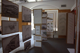
Hawkinson Studio* went for the artistic approach, displaying everything on the wall and table without text. The work was nice, though, and I thought this display was one of the most impressive. All the models were milled, which requires some skill and planning. There was something on a screen, but usually things on screens can safely be ignored. I have no idea what the project was about, but it seemed interesting. This is a fairly typical art-oriented display.


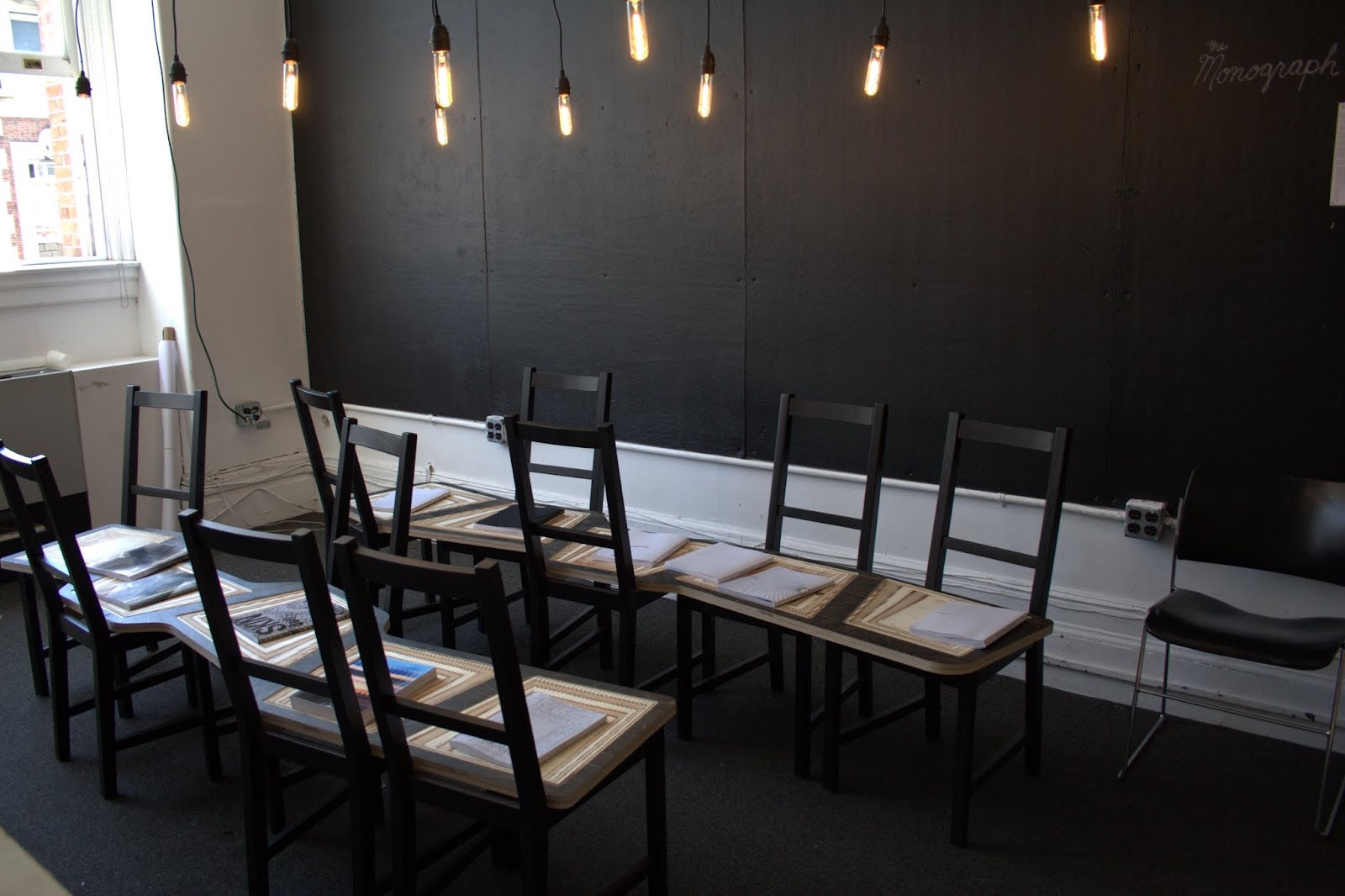
Below, from top to bottom: nARCHITECTS Studio, Shigematsu Studio, LOT-EK Studio, Bell Studio. Not pictured: Wasiuta Studio (it hurt my eyes too much - I couldn't stand the bizarre 3D glasses effect they were going for), and a few others. nARCHITECTS Studio's display was quite nice, I especially liked their oversized renderings that were hung up like room dividers. Shigematsu Studio's display was cutesy with quotes in the red squares from their trip to Japan. LOT-EK Studio's display was, well, coffee-shop hipster, I think. I didn't read any of the monographs on the chairs, although I liked the fancy bulbs, sort of steampunk. Bell Studio's eco-minimalist design (it gives off a recycled-paper vibe) was appealing and made me want to investigate the project further.


Kaseman Studio, below, was another slather-it-on approach, with models hanging from the ceiling, stuffed under the counters, and covering all the flat surfaces they constructed. I don't know if the hanging/flying models were supposed to indicate something that would actually be in the air, or not. Some of the models were lit up internally and were pretty cool looking, although, again, I had no idea what they were supposed to be.


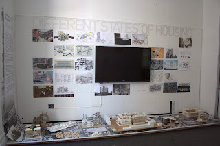
Second-Year Housing Studio: This display of our first-semester work was put together by a TA, but I think he did a nice job despite the wall text falling off repeatedly. It came down in a curve from wall to floor, but the wall part wouldn't stay put. I don't think the title ("Different States of Housing") made any sense, but this was one exhibit with so much text that one couldn't be bothered to read it, so I'm not sure if it somehow linked in there. I think the title was a critic's, and not the TA's, anyway. My model is below, in white and blue (with thanks to my studio partner, John Barnes).

C-BIP Studio (Marble, Benjamin, Kurgan): Here it is, my own studio's contribution! Since there were 30 of us in the studio (and three critics), we couldn't really agree on how to do the exhibition, so it has several discrete parts that didn't quite mesh in the end, unfortunately. In the middle of the room we built a freestanding "black box" with some explanatory text, photos of ourselves and our "elements" in a connecting grid, and a game with stickers. Inside the box was a blacklight and pages of white code on a black background to symbolize the "black boxes" we all created as part of the studio (that is, working pieces of code that we passed off to our neighbors, who then had to use the code without understanding how it worked). And there was a screen mounted on it for some reason. Around the box were posters of the different building elements and strategies, supposedly stratified (strategies above, elements below), but I don't think that distinction came through at all in the final display. That part was contributed by the throw-everything-on-the-wall adherents in the studio. In the end I don't think our display made much sense, but then again, neither did our studio, so perhaps it was the perfect reflection of our semester's work.


More second-year studios. From top: Space Studio, Solomonoff Studio, Marino Studio, Kim Studio. Not pictured: tiny dioramas from Varnelis Studio. I was most impressed with Marino Studio's display - their projects were for a shipbuilding museum on Long Island, and their display used sand as the model base. The skeletal, uniformly cardboard models really did remind one of ships being built on the shore. Well done. Space Studio was appropriately "out-there," while Kim Studio's postcards were strange and confusing. I applaud their decision to make their display interactive (I think the idea was to take a postcard and mail it to the pre-printed address as a political statement), but I don't think it showcased their work very well.


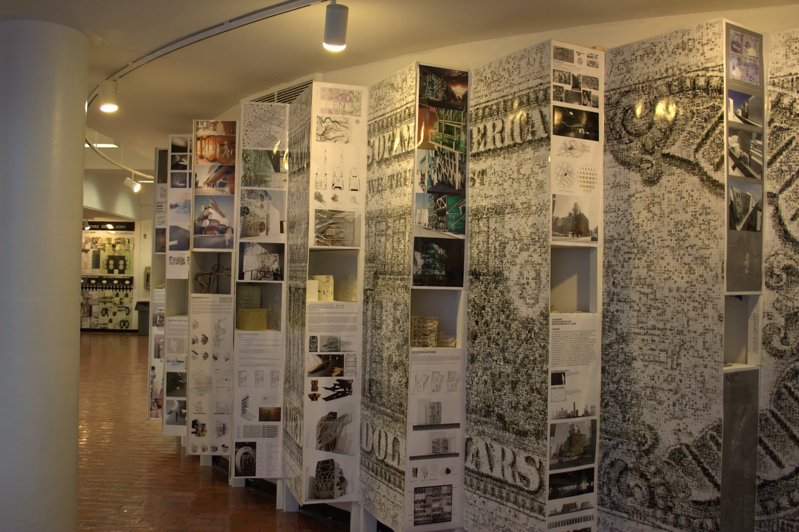
First Year studios. From top: Kumpusch Studio, Rothstein Studio, Klein Studio, Andraos Studio, Rakatansky Studio. Not pictured: Goberna, Wilson, Seewang studios. The first-year projects were for banks. I wasn't able to figure this out until about halfway through the exhibition, when I finally remembered what my first-year friends had told me. Klein Studio gets honorable mention for the giant $100 bill printed on the back of their display that reminded me. As we ourselves did last year, the first-years put a lot of effort into their generally "high concept" displays, but I don't think this helped explain what they were doing at all. Kumpusch Studio's giant frame and prism was especially weird and unintelligible. Maybe I'm missing something. The matching "fans" of displays on the two sides of the room (Rothstein and Klein) were nice, although I doubt that they were coordinated in the advance. Most of the studios seemed to be going for the slathering approach ("just put it all up there!"), although I thought Rakatansky's group did a nice job addressing their terrible location (on two sides of a very active hallway). Wilson Studio built a straw contraption suspiciously similar to last year's cardboard tube contraption that was in almost the same location. Goberna Studio, thanks for the non sequitur buttons. Mine says, "I am a double agent architect. Welcome to my machine."


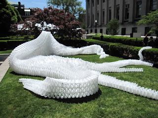
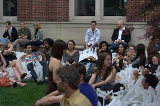
And finally, special mention goes to the creators of FY-Langes, a fun and innovative seating installation as part of the Fast Pace/Slow Space class. It seemed to be a great success, and I saw it again at the Governor's Island "Figment" art fair where it was further abused by enthusiastic visitors. Below, before-and-after shots from the show opening. My only disappointment with this project was the choice of material, since I think packing foam is a waste of energy and fossil fuels. You couldn't find any natural material that would fit your needs? Maybe I'm being a humbug for calling you out on your material choice, but really - would nothing but plastic foam work? It's an extremely durable material being used for an extremely temporary use. I just hope you recycled it afterward.
Of course, there were displays from all the other GSAPP programs as well - Historic Preservation, Urban Planning, the technology and visual studies classes, etc - but I didn't find these to be as interesting and I don't have any photos. This year our displays were more cramped than usual because Buell Hall is under renovation, so the usual third-year gallery space wasn't available. Tech classes and visual studies were relegated to the corridors, making for awkward displays. In all, though, the EOYS was an impressive outpouring of energy from the student body, and surely must have rivaled the final exhibitions at a number of art schools. Good work, everyone, and I hope you enjoyed your well-deserved rest afterward!
GSAPP classes resume next week, so I apologize in advance if posts slow down during the year. But stay tuned for more summer reading comments!
*Note on studio critics: I chose not to link to the critics' websites for two reasons: 1) The critics usually have very little input into the final exhibition; 2) Architects' websites are notoriously bad, and I would be embarrassed to show them to you. So please excuse the lack of links in this post.
Personally I would love to see an exhibition that manages to walk the line between these extremes by presenting the work artfully, since many student projects are purposely experimental or "artistic," while also allowing a casual viewer to have some idea of what's going on. Maybe that's asking too much from a bunch of sleep-deprived people who would rather be on vacation, but that would be my goal.
So here are the M. Arch. exhibitions from this year, and we'll see what C-BIP, my own studio, managed to put together. (If you're curious, past EOYS images can be seen here (2009) and here (2010) and here (2011).) My full album of photos of the exhibition is here.
Third-Year Studios:
Hawkinson Studio* went for the artistic approach, displaying everything on the wall and table without text. The work was nice, though, and I thought this display was one of the most impressive. All the models were milled, which requires some skill and planning. There was something on a screen, but usually things on screens can safely be ignored. I have no idea what the project was about, but it seemed interesting. This is a fairly typical art-oriented display.


Below, from top to bottom: nARCHITECTS Studio, Shigematsu Studio, LOT-EK Studio, Bell Studio. Not pictured: Wasiuta Studio (it hurt my eyes too much - I couldn't stand the bizarre 3D glasses effect they were going for), and a few others. nARCHITECTS Studio's display was quite nice, I especially liked their oversized renderings that were hung up like room dividers. Shigematsu Studio's display was cutesy with quotes in the red squares from their trip to Japan. LOT-EK Studio's display was, well, coffee-shop hipster, I think. I didn't read any of the monographs on the chairs, although I liked the fancy bulbs, sort of steampunk. Bell Studio's eco-minimalist design (it gives off a recycled-paper vibe) was appealing and made me want to investigate the project further.


Kaseman Studio, below, was another slather-it-on approach, with models hanging from the ceiling, stuffed under the counters, and covering all the flat surfaces they constructed. I don't know if the hanging/flying models were supposed to indicate something that would actually be in the air, or not. Some of the models were lit up internally and were pretty cool looking, although, again, I had no idea what they were supposed to be.


Second-Year Housing Studio: This display of our first-semester work was put together by a TA, but I think he did a nice job despite the wall text falling off repeatedly. It came down in a curve from wall to floor, but the wall part wouldn't stay put. I don't think the title ("Different States of Housing") made any sense, but this was one exhibit with so much text that one couldn't be bothered to read it, so I'm not sure if it somehow linked in there. I think the title was a critic's, and not the TA's, anyway. My model is below, in white and blue (with thanks to my studio partner, John Barnes).


C-BIP Studio (Marble, Benjamin, Kurgan): Here it is, my own studio's contribution! Since there were 30 of us in the studio (and three critics), we couldn't really agree on how to do the exhibition, so it has several discrete parts that didn't quite mesh in the end, unfortunately. In the middle of the room we built a freestanding "black box" with some explanatory text, photos of ourselves and our "elements" in a connecting grid, and a game with stickers. Inside the box was a blacklight and pages of white code on a black background to symbolize the "black boxes" we all created as part of the studio (that is, working pieces of code that we passed off to our neighbors, who then had to use the code without understanding how it worked). And there was a screen mounted on it for some reason. Around the box were posters of the different building elements and strategies, supposedly stratified (strategies above, elements below), but I don't think that distinction came through at all in the final display. That part was contributed by the throw-everything-on-the-wall adherents in the studio. In the end I don't think our display made much sense, but then again, neither did our studio, so perhaps it was the perfect reflection of our semester's work.


More second-year studios. From top: Space Studio, Solomonoff Studio, Marino Studio, Kim Studio. Not pictured: tiny dioramas from Varnelis Studio. I was most impressed with Marino Studio's display - their projects were for a shipbuilding museum on Long Island, and their display used sand as the model base. The skeletal, uniformly cardboard models really did remind one of ships being built on the shore. Well done. Space Studio was appropriately "out-there," while Kim Studio's postcards were strange and confusing. I applaud their decision to make their display interactive (I think the idea was to take a postcard and mail it to the pre-printed address as a political statement), but I don't think it showcased their work very well.


First Year studios. From top: Kumpusch Studio, Rothstein Studio, Klein Studio, Andraos Studio, Rakatansky Studio. Not pictured: Goberna, Wilson, Seewang studios. The first-year projects were for banks. I wasn't able to figure this out until about halfway through the exhibition, when I finally remembered what my first-year friends had told me. Klein Studio gets honorable mention for the giant $100 bill printed on the back of their display that reminded me. As we ourselves did last year, the first-years put a lot of effort into their generally "high concept" displays, but I don't think this helped explain what they were doing at all. Kumpusch Studio's giant frame and prism was especially weird and unintelligible. Maybe I'm missing something. The matching "fans" of displays on the two sides of the room (Rothstein and Klein) were nice, although I doubt that they were coordinated in the advance. Most of the studios seemed to be going for the slathering approach ("just put it all up there!"), although I thought Rakatansky's group did a nice job addressing their terrible location (on two sides of a very active hallway). Wilson Studio built a straw contraption suspiciously similar to last year's cardboard tube contraption that was in almost the same location. Goberna Studio, thanks for the non sequitur buttons. Mine says, "I am a double agent architect. Welcome to my machine."


And finally, special mention goes to the creators of FY-Langes, a fun and innovative seating installation as part of the Fast Pace/Slow Space class. It seemed to be a great success, and I saw it again at the Governor's Island "Figment" art fair where it was further abused by enthusiastic visitors. Below, before-and-after shots from the show opening. My only disappointment with this project was the choice of material, since I think packing foam is a waste of energy and fossil fuels. You couldn't find any natural material that would fit your needs? Maybe I'm being a humbug for calling you out on your material choice, but really - would nothing but plastic foam work? It's an extremely durable material being used for an extremely temporary use. I just hope you recycled it afterward.


Of course, there were displays from all the other GSAPP programs as well - Historic Preservation, Urban Planning, the technology and visual studies classes, etc - but I didn't find these to be as interesting and I don't have any photos. This year our displays were more cramped than usual because Buell Hall is under renovation, so the usual third-year gallery space wasn't available. Tech classes and visual studies were relegated to the corridors, making for awkward displays. In all, though, the EOYS was an impressive outpouring of energy from the student body, and surely must have rivaled the final exhibitions at a number of art schools. Good work, everyone, and I hope you enjoyed your well-deserved rest afterward!
GSAPP classes resume next week, so I apologize in advance if posts slow down during the year. But stay tuned for more summer reading comments!
*Note on studio critics: I chose not to link to the critics' websites for two reasons: 1) The critics usually have very little input into the final exhibition; 2) Architects' websites are notoriously bad, and I would be embarrassed to show them to you. So please excuse the lack of links in this post.
Comments
Post a Comment